
A meteorologist must convey a lot of information without using a lot of words. When looking at a weather map, a meteorologist needs to know where the cold air is, where the warm air is, where it is raining, what type of clouds are in the area, and many more things. The reason for this is that forecasts need to be accurate. But, they also need to be timely.
If too much time is spent making the forecast, it will be late. Not many people want to know what the weather was doing twenty minutes ago. Most people want to know what the weather is going to do in the near future. Because of this, weather symbols were invented so that weather maps could be looked at in a short amount of time.
There are a large number of weather symbols in existence. Some are used for weather like rain, snow, and lightning. There are also symbols representing the speed of the wind, types of clouds, air temperature, and air pressure. All of these symbols help meteorologists forecast the weather in a timely manner.
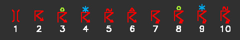
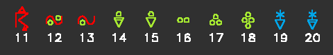
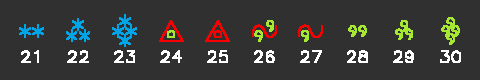
B. What Do Some Weather Symbols Look Like?
The following image shows many different weather symbols. Look at the symbols, do they look like the weather they represent?

The weather map was not developed until the telegraph was working. Back in the 1870's, the first weather map came to be. At that time, the government meteorologists worked for the US Army Signal Service. Later, this department became the Weather Bureau and now it is known as the National Weather Service.
In order to make a weather map, stations from around the country would take observations. Meteorologists recorded temperature, wind speed and direction, and pressure. This data was then sent to one location, Washington, DC, where it was analyzed by hand.
Unfortunately, a large part of the US was not well populated in the late 1800s and early 1900s. The weather maps of the day were not complete since they were missing observations from most of the central Plains states. Also, meteorologists did not always understand what the maps they were analyzing meant. Many of the theories used today in forecasting had not yet been developed.
B. How Do Weather Maps Help Meteorologists?
The weather map is the most valuable tool that the meteorologist uses to forecast the weather. Without this tool, it would be very hard to predict what the weather was going to do. Weather maps summarize what is happening in the atmosphere at a certain time, and it would be very difficult to predict changes in the weather without these maps.
By looking at weather maps from different heights in the atmosphere, a meteorologist can make a three-dimensional picture, in their heads, of what is happening in the atmosphere. They can tell whether a particular area has high or low pressure, whether it may rain, and many other things just by looking at a weather map.
Today, weather observations are taken from thousands of locations. This data is then sent to Washington, DC where it is analyzed. Computers are the main tool creating weather maps since they can handle large amounts of data quickly. Forecasts have become much more accurate since meteorologists have better weather maps than in the past.
C. Analyze a Map on Your Own
The following are a few sources of current weather maps. Sometimes a site may be down or experiencing data losses. In such a case, try another site listed. This is not meant to be an exhaustive list. These are provided for your convenience. Updated April 24, 2003
These weather maps are similar to those used by meteorologists. On the Ohio State maps, the blue lines are cold fronts and the red ones are warm fronts. The NOAA map also has warm and cold fronts shown, but in black. Cold fronts have triangles along the line indicating the position of the front and warm fronts have half-circles.
On all maps, the white circles with lines coming out of them are wind barbs. They point towards the direction from which the wind is coming from. The number above and on the right of the wind barbs tell about the atmospheric pressure at that location. Large numbers mean there is high pressure and smaller numbers mean there is low pressure. The maximum is symbolized with a blue H (Ohio State map) while the minimum has a red L. Differences between high and low pressure causes wind, and air moves counter-clockwise around areas of low pressure and clockwise around areas of high pressure.